Scope: Rebranding
Role: Art Direction, Design
Role: Art Direction, Design

Context
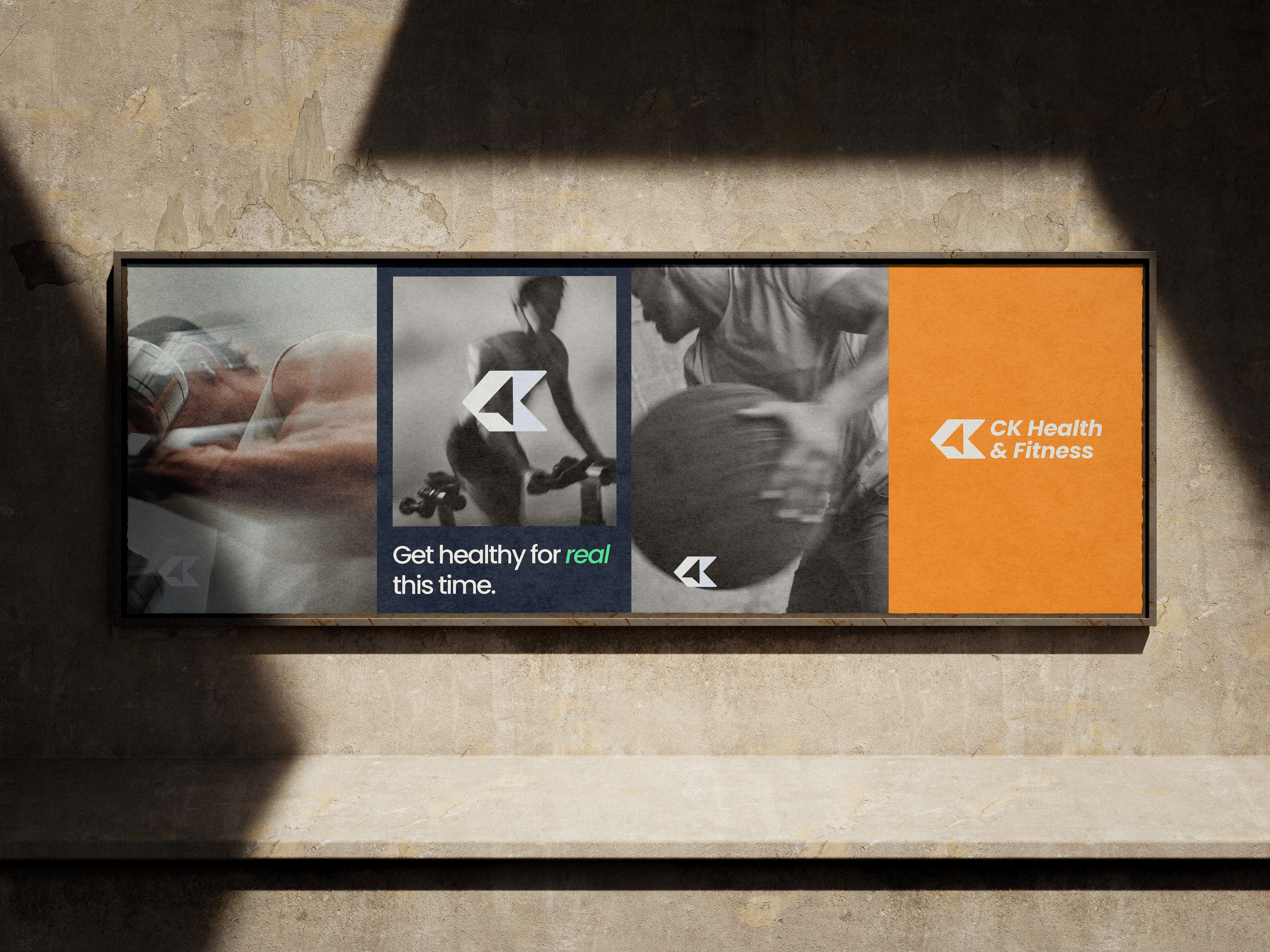
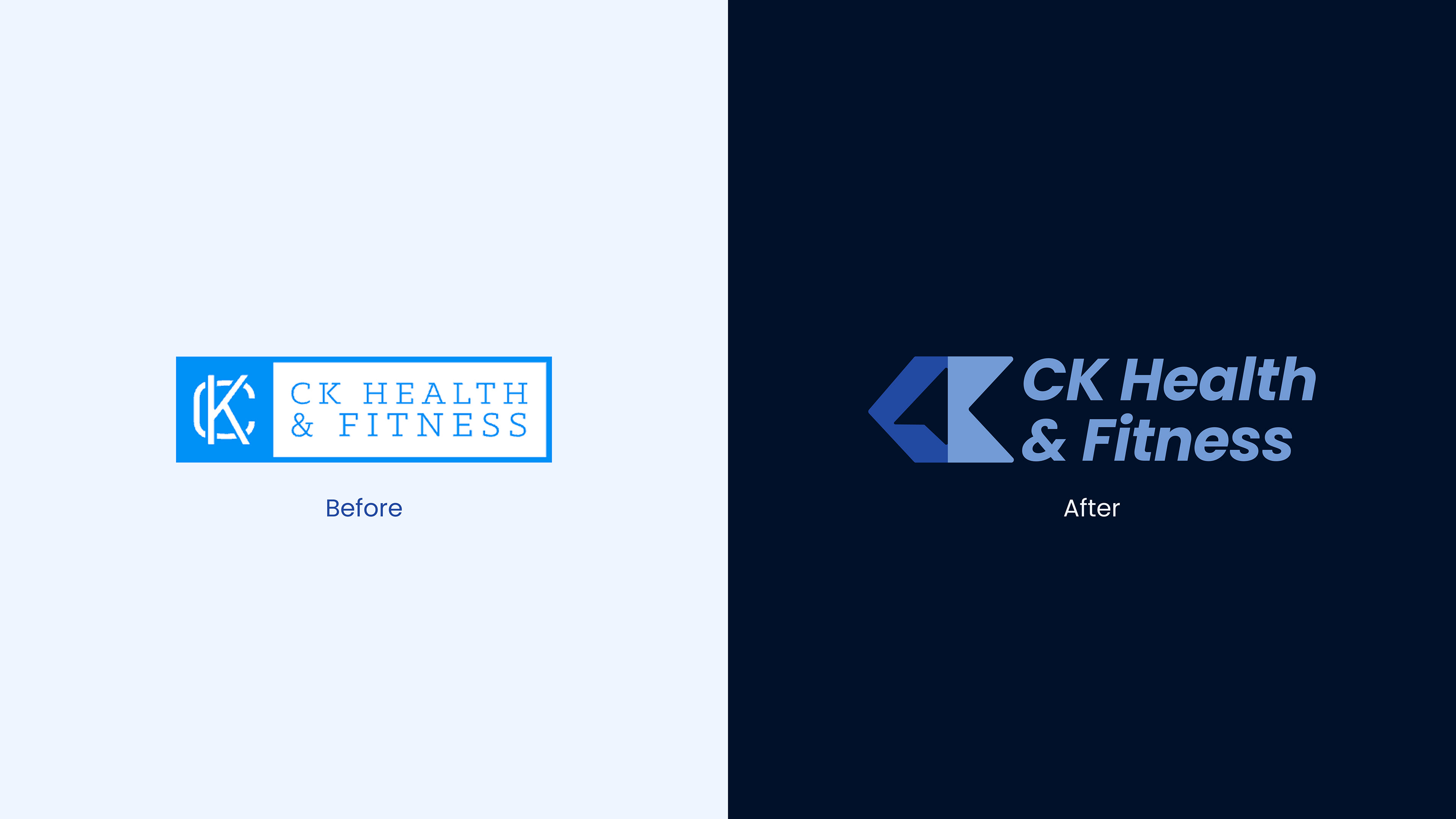
CK Health & Fitness is a Franklin, TN-based health and fitness practice offering in-person and online personal training, plus health and nutrition coaching. The redesign needed to position the coach as a guide in his clients' transformation, not the center of it, while still converting visitors into booked consultations.
Challenge
The logo design needed to reflect a very specific coaching philosophy: the coach as guide, not hero. Most fitness branding leans on intensity, ego, and before-and-after spectacle. This identity needed the opposite: a mark that felt steady, directional, and trustworthy, without losing energy or credibility in a competitive local fitness and wellness market.
Approach
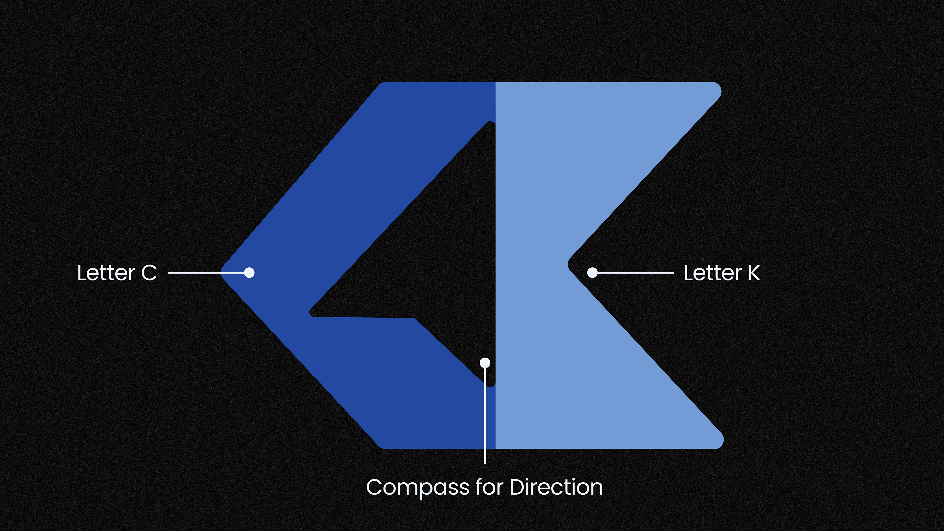
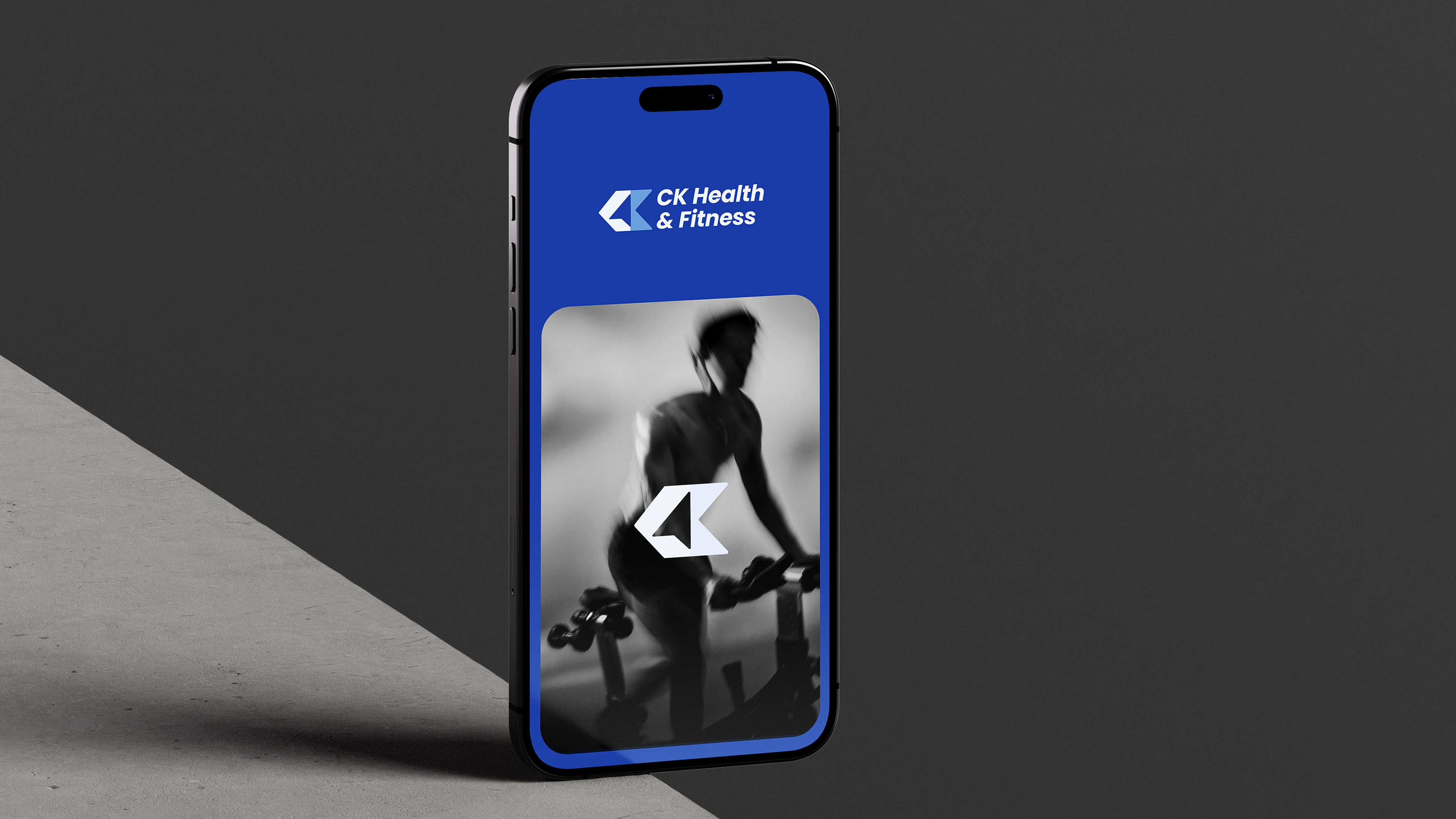
The logo concept centered on the client's own initials, C and K, but the real idea lived in the negative space between them: a compass symbol, representing direction and guidance rather than performance or transformation for its own sake. It's a quiet design detail, but it does the brand positioning work the whole identity needed: the coach points the way, the client does the moving.
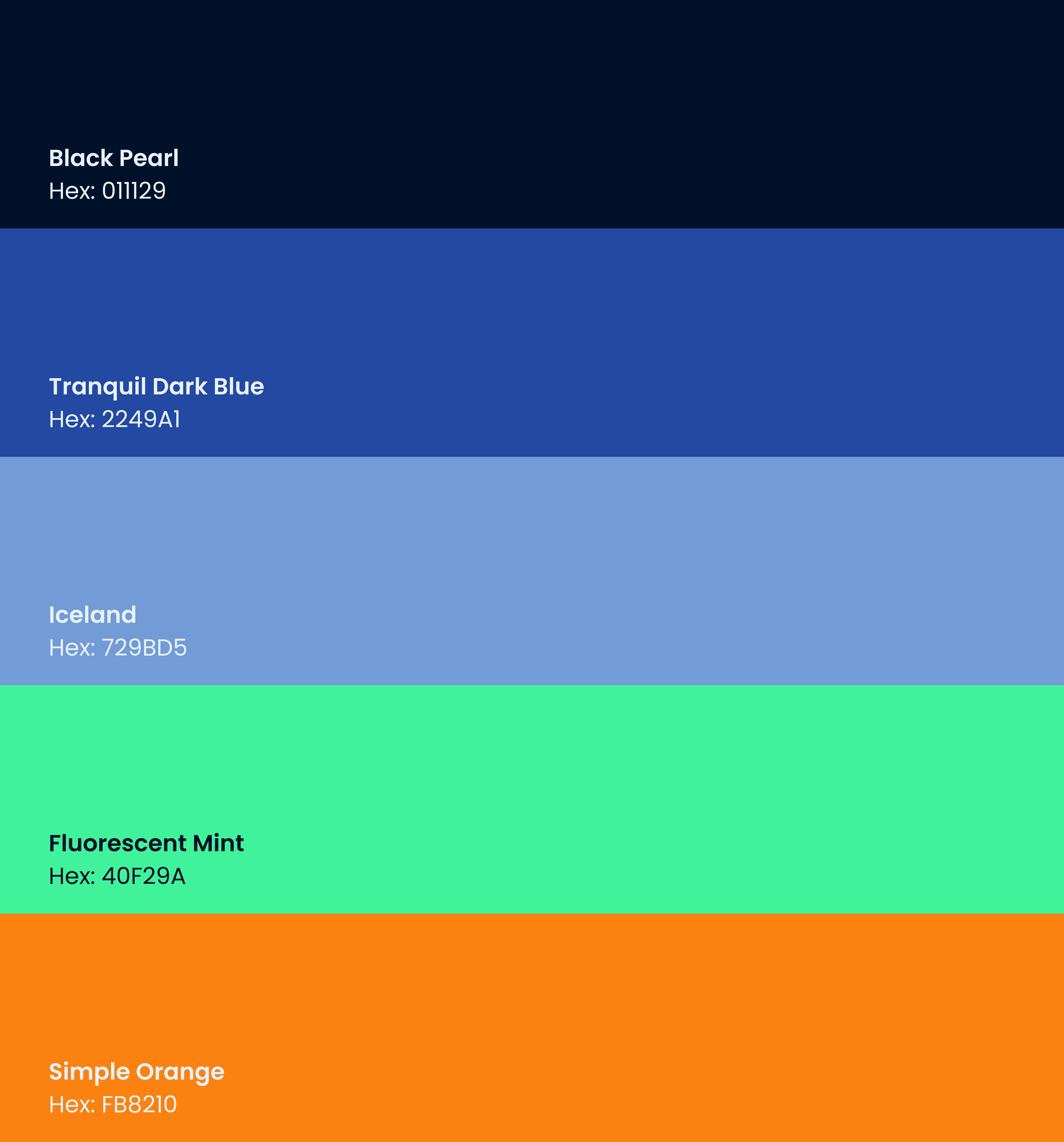
Color direction stayed close to the client's original brand identity, refined rather than replaced through the rebrand, keeping visual continuity for existing clients while giving the new logo design room to feel more current and consistent across print, web, and social media applications.

Outcome
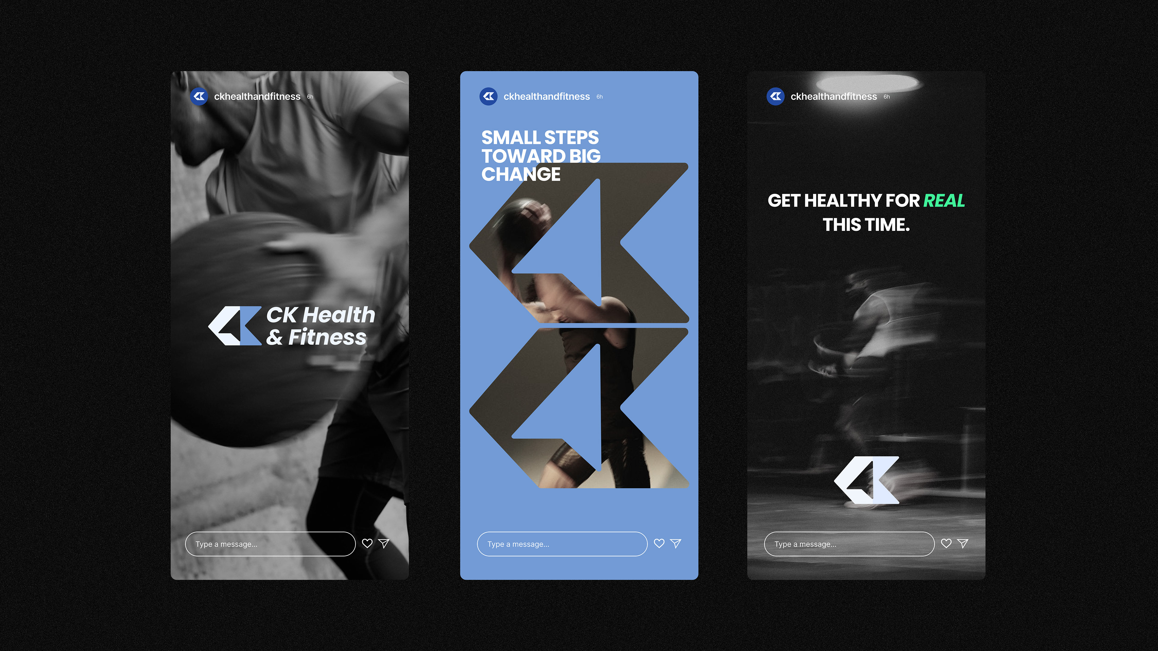
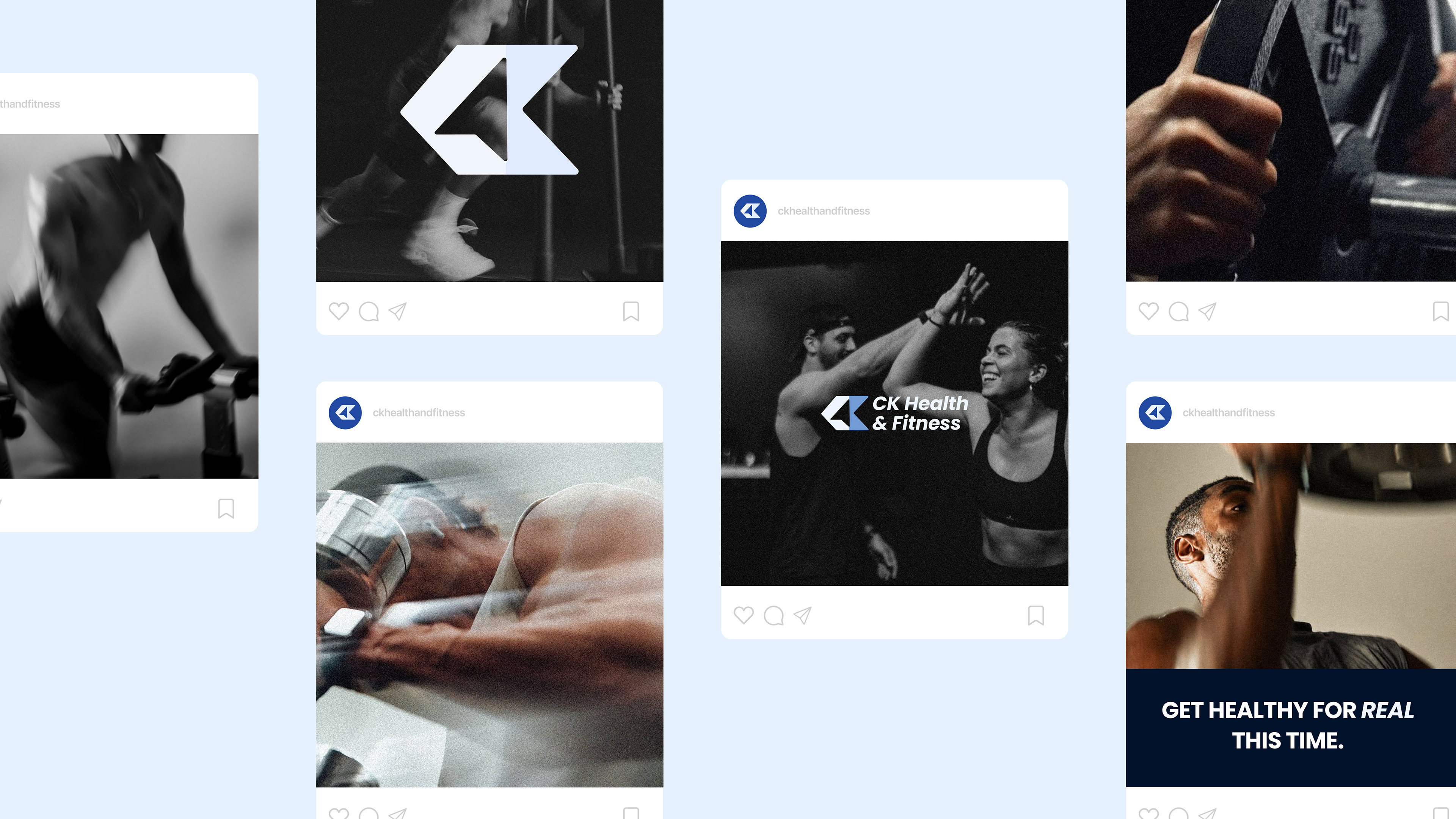
The new brand identity gives CK Health & Fitness a logo and visual system that reflects how the coach actually works: present, directional, and client-centered, while staying flexible enough to carry consistently across the website, social media, and printed marketing materials.