Project: Tri-fold Brochure
Scope: Brand & Marketing Design
Role: Art Direction, Design
Scope: Brand & Marketing Design
Role: Art Direction, Design
The Approach
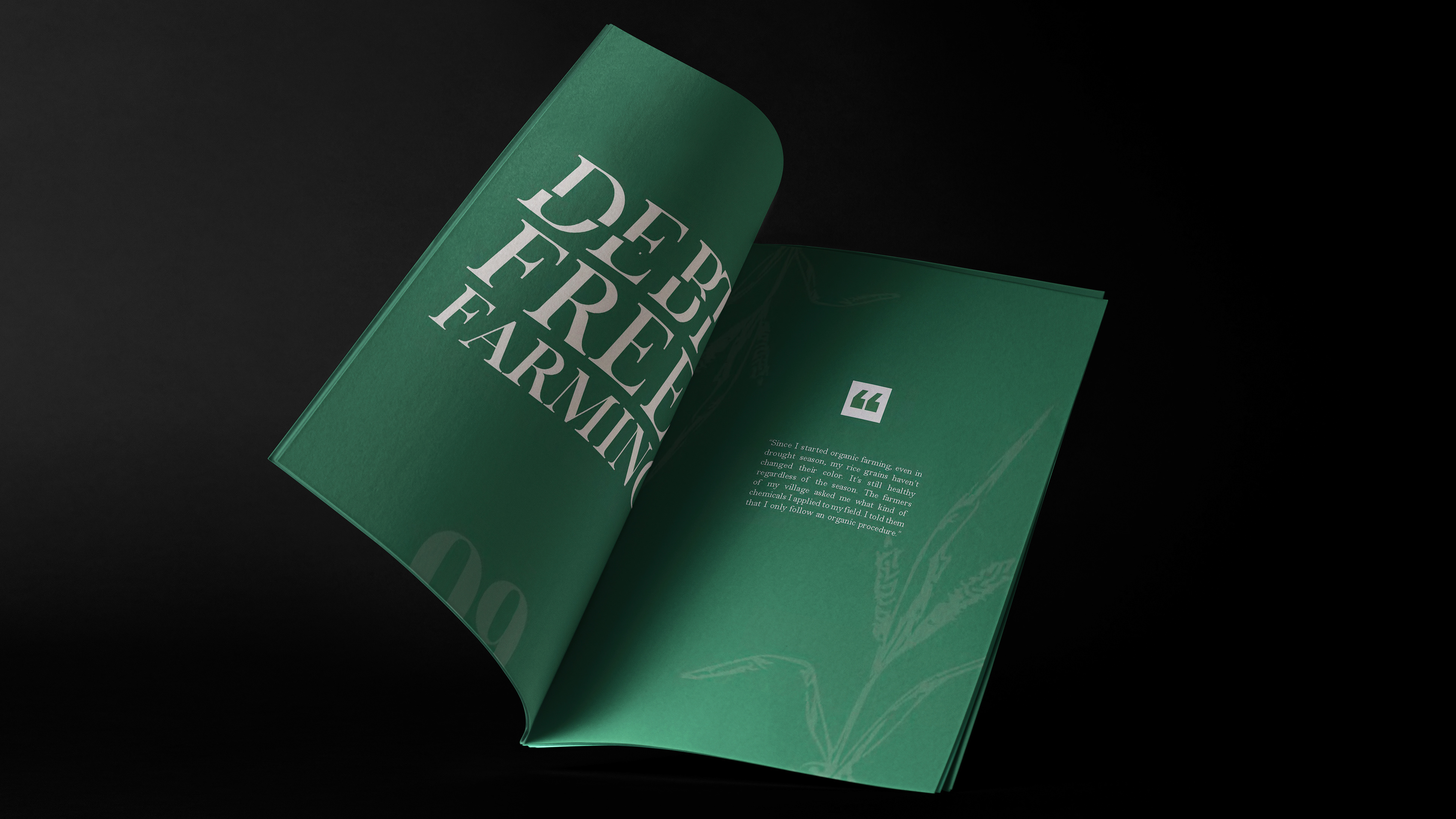
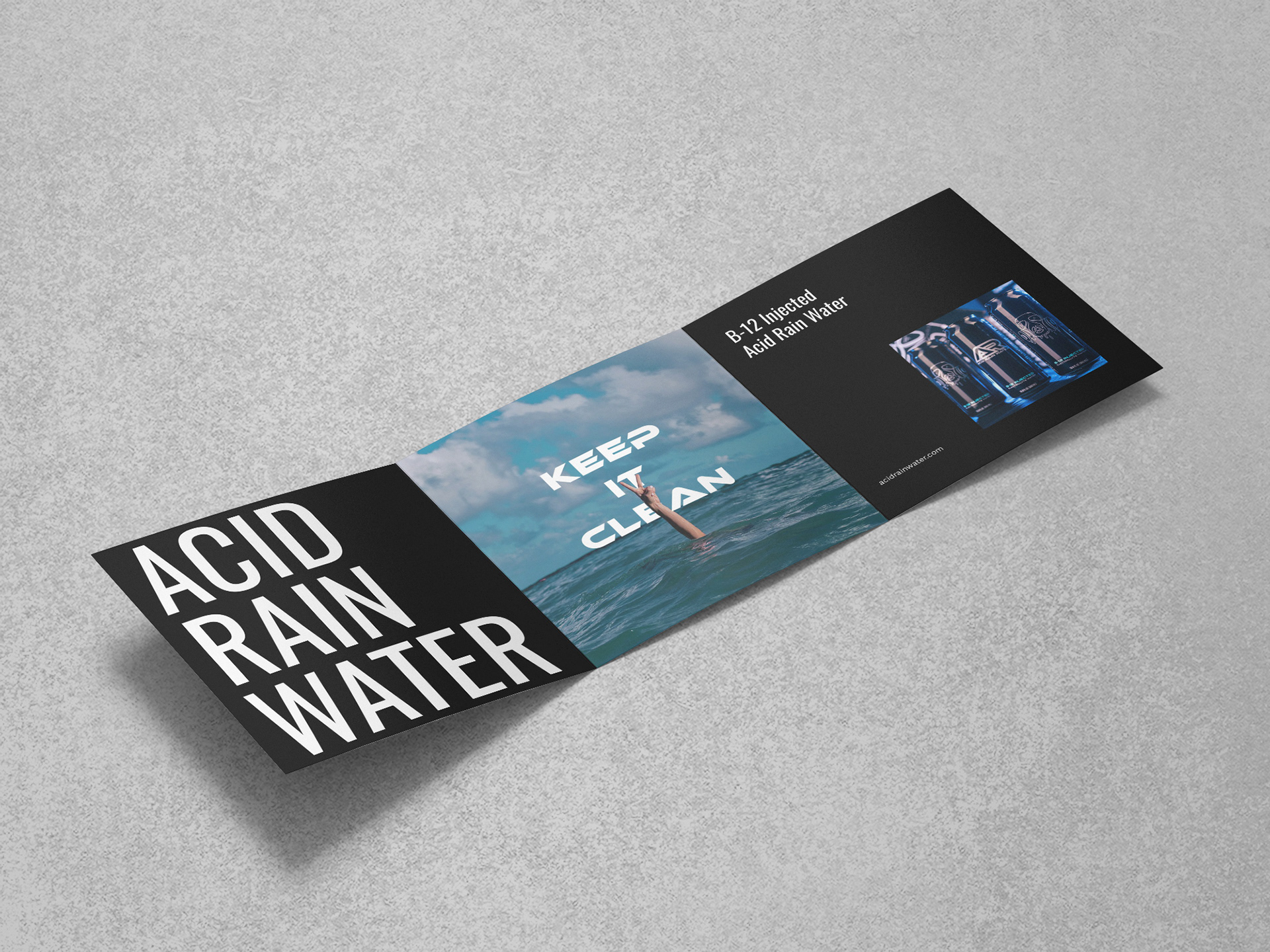
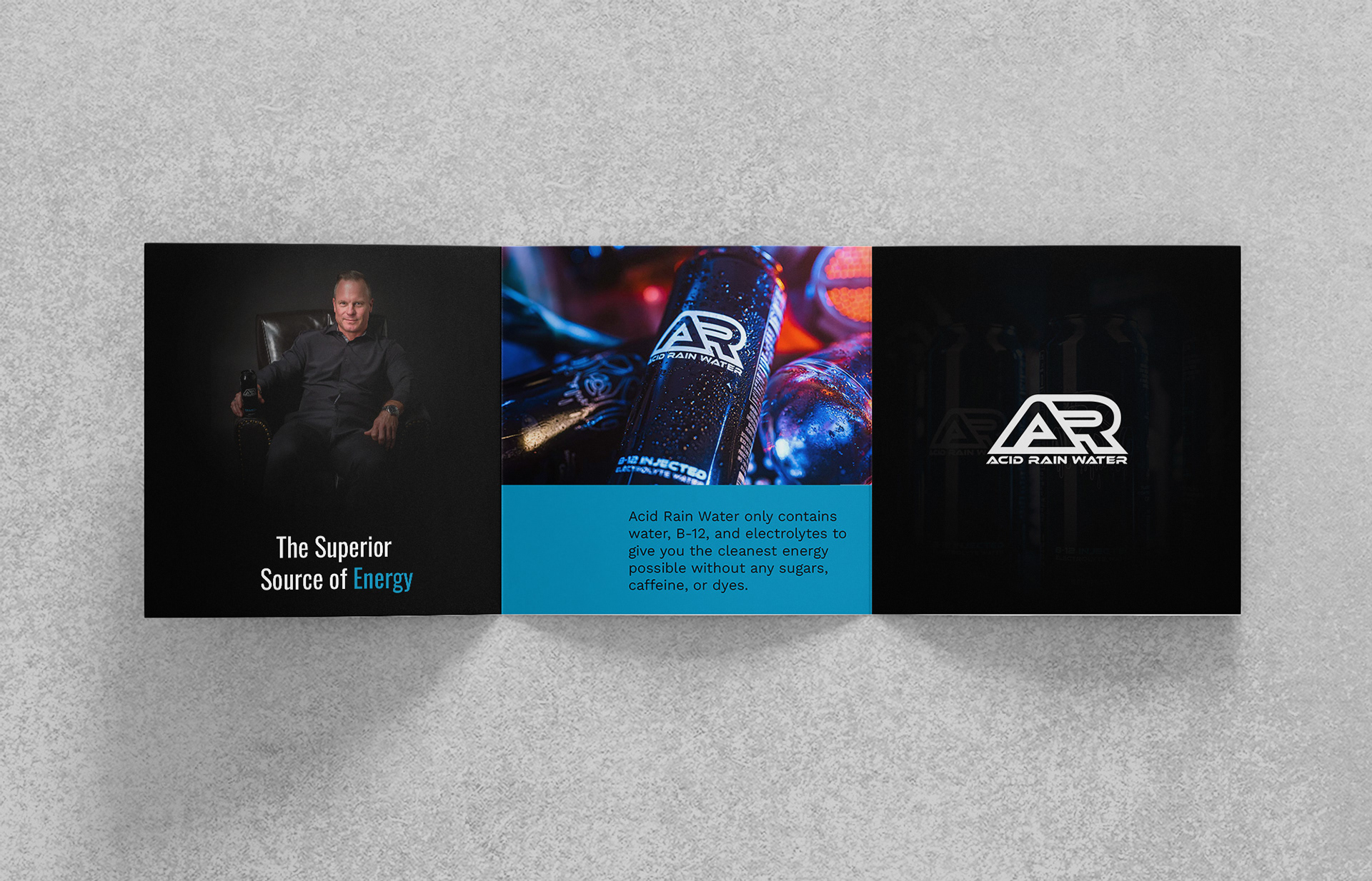
Each panel followed one focal point instead of competing for attention with the next. Strong contrast, restrained typography, and a simple hierarchy carried the identity across the fold, so the brochure felt like one continuous system rather than six separate panels stitched together.
The Outcome
The final brochure delivered a confident, high contrast identity that stayed clear and readable across every panel and fold. The system let the product stand out on shelf and in hand, while keeping the brand consistent from the first panel to the last.
The Outcome
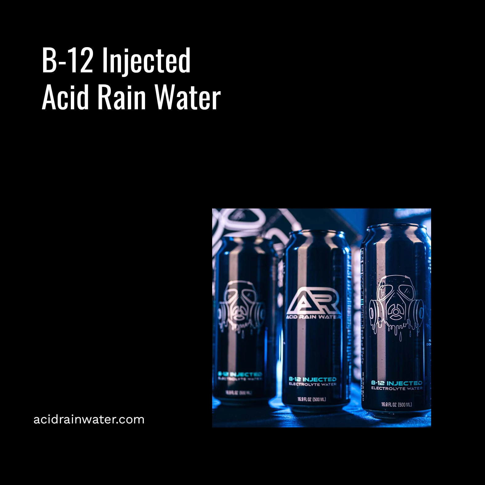
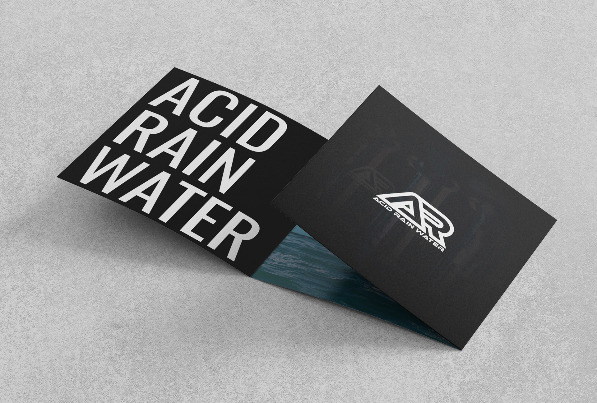
The final visuals established a clear and confident direction using strong contrast, simple hierarchy, and restrained typography. The system helped the product stand out while maintaining consistency and readability across layouts.