Scope: Rebranding
Role: Art Direction, Design
Role: Art Direction, Design
Context
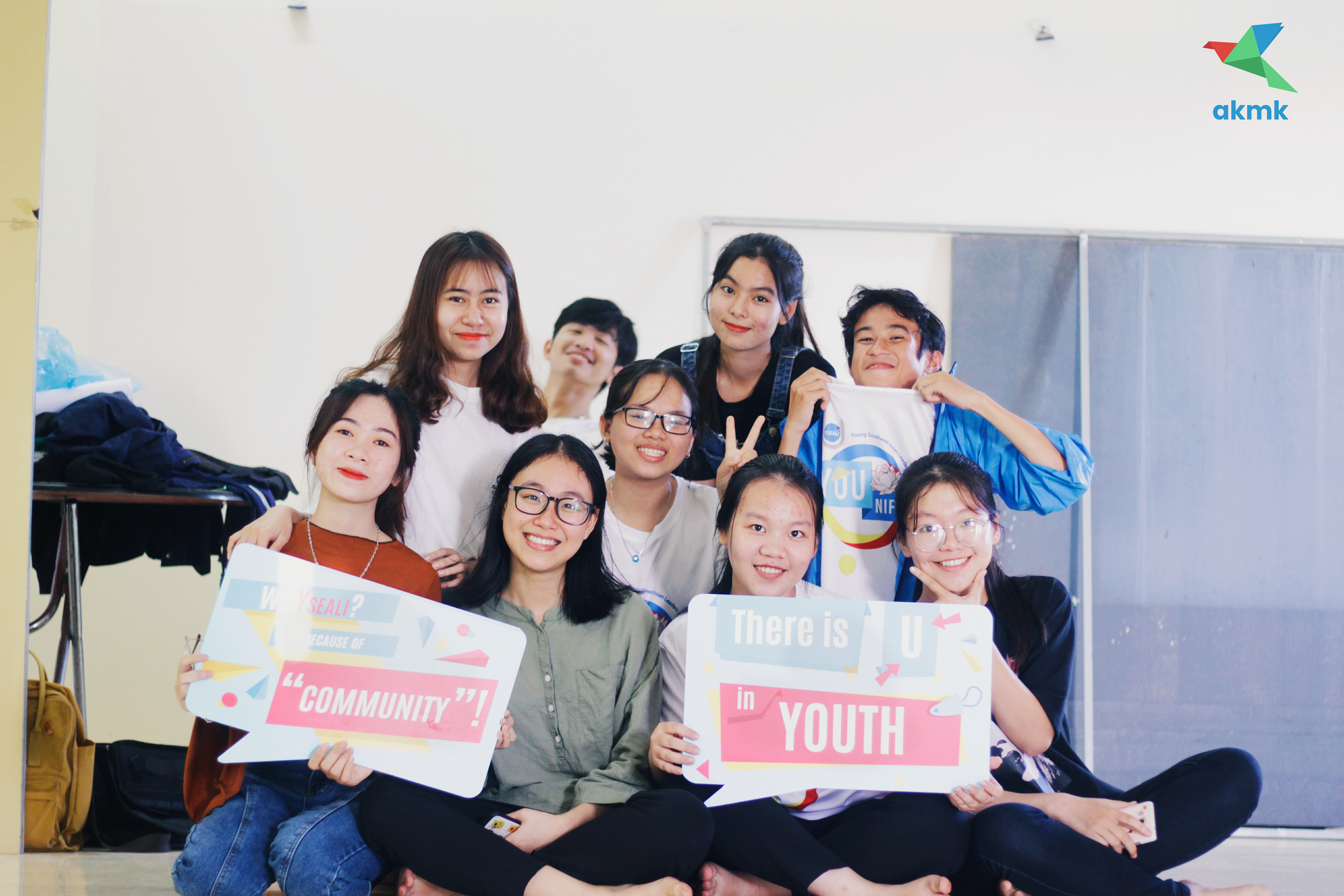
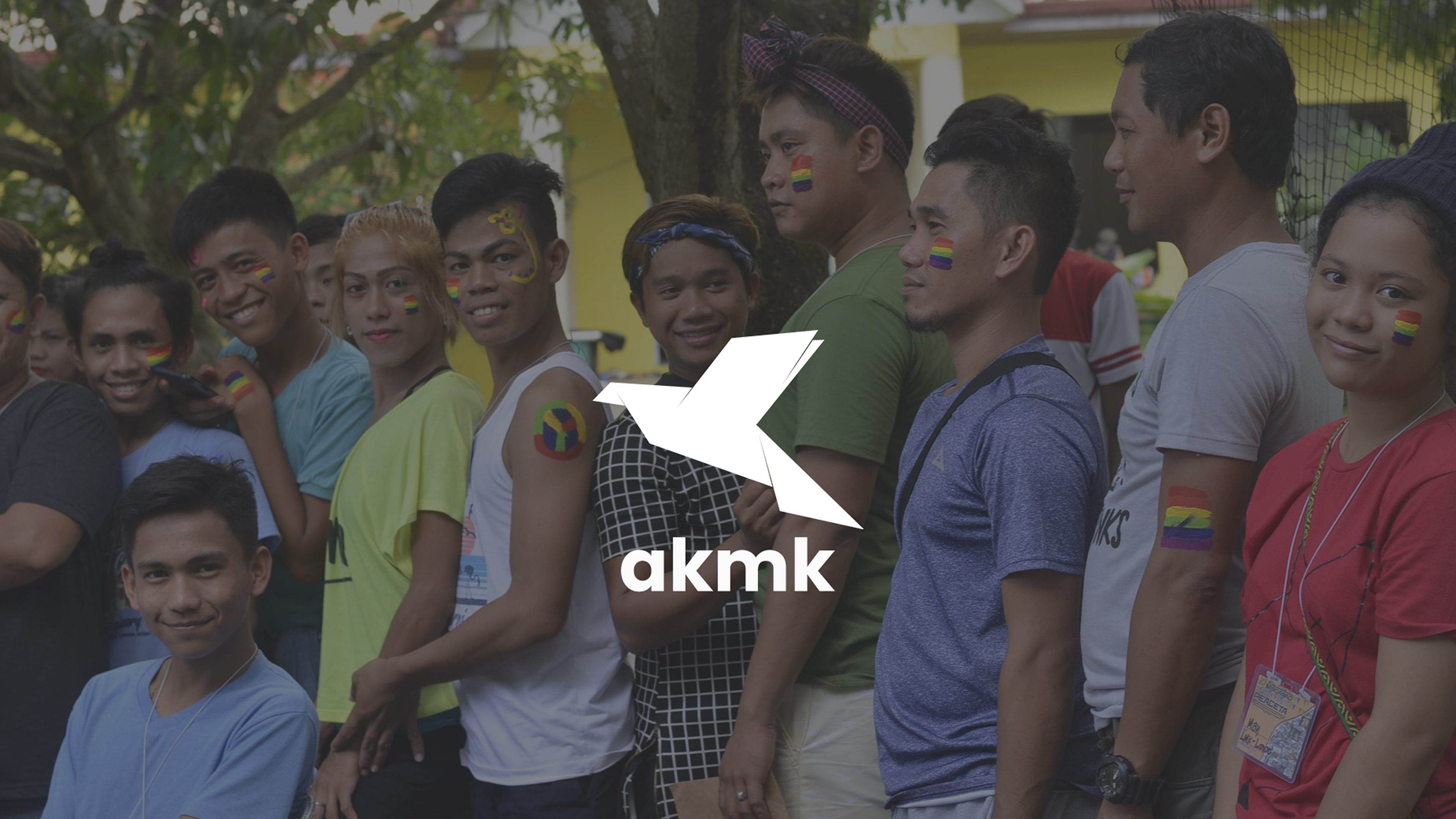
AKMK works on peace-building and community initiatives rooted in cultural diversity. Over time, the visual identity no longer aligns with the direction of its work. Over time, it started to feel heavy and outdated. It was also difficult to use across fundraising and digital materials.
As the organization grew, there was a clear need for an identity that felt more modern and easier to apply across different platforms.

Challenge
The challenge was to modernize the identity without losing its core message of peace in diversity. The new look needed to feel more current and confident. It also had to respect the cultural meaning and recognition built with its communities, partners, and funders.
Approach
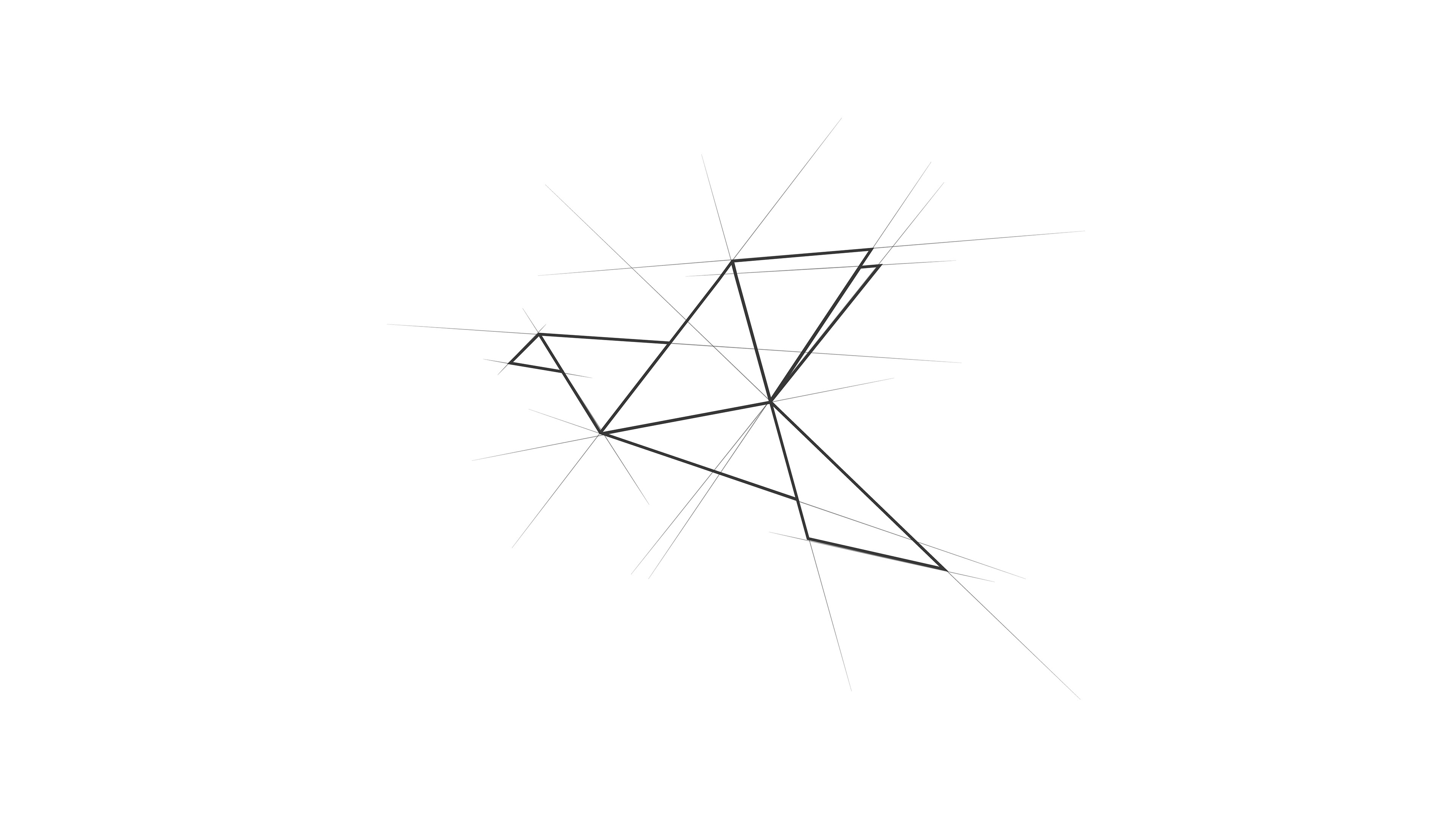
The work followed a structured FOCUS approach. The existing logo was reviewed for clarity, symbolism, and usability. Several issues surfaced, including visual noise, unnecessary effects, and elements that weakened recognition and scalability.
Research focused on understanding which symbols truly represented the organization’s mission. From this, a new concept was developed around a dove origami form to represent peace and unity. The triangular structure referenced indigenous culture and connected to the organization’s art programs.

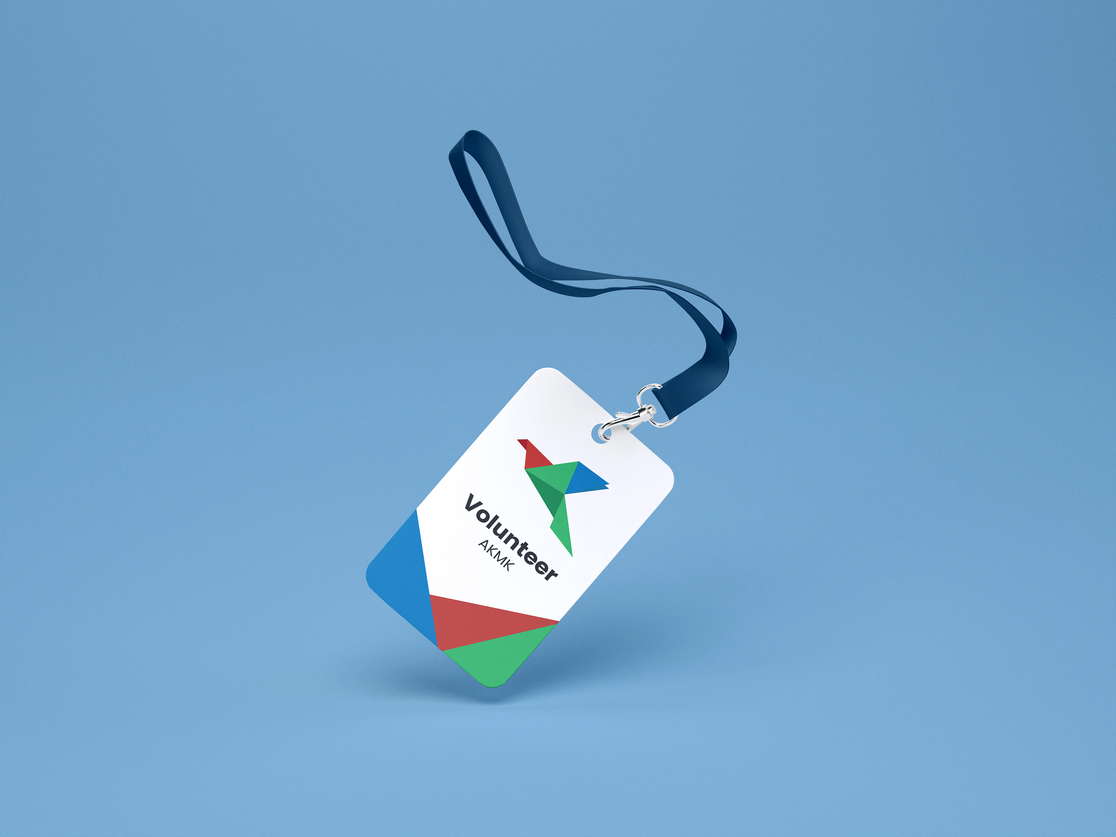
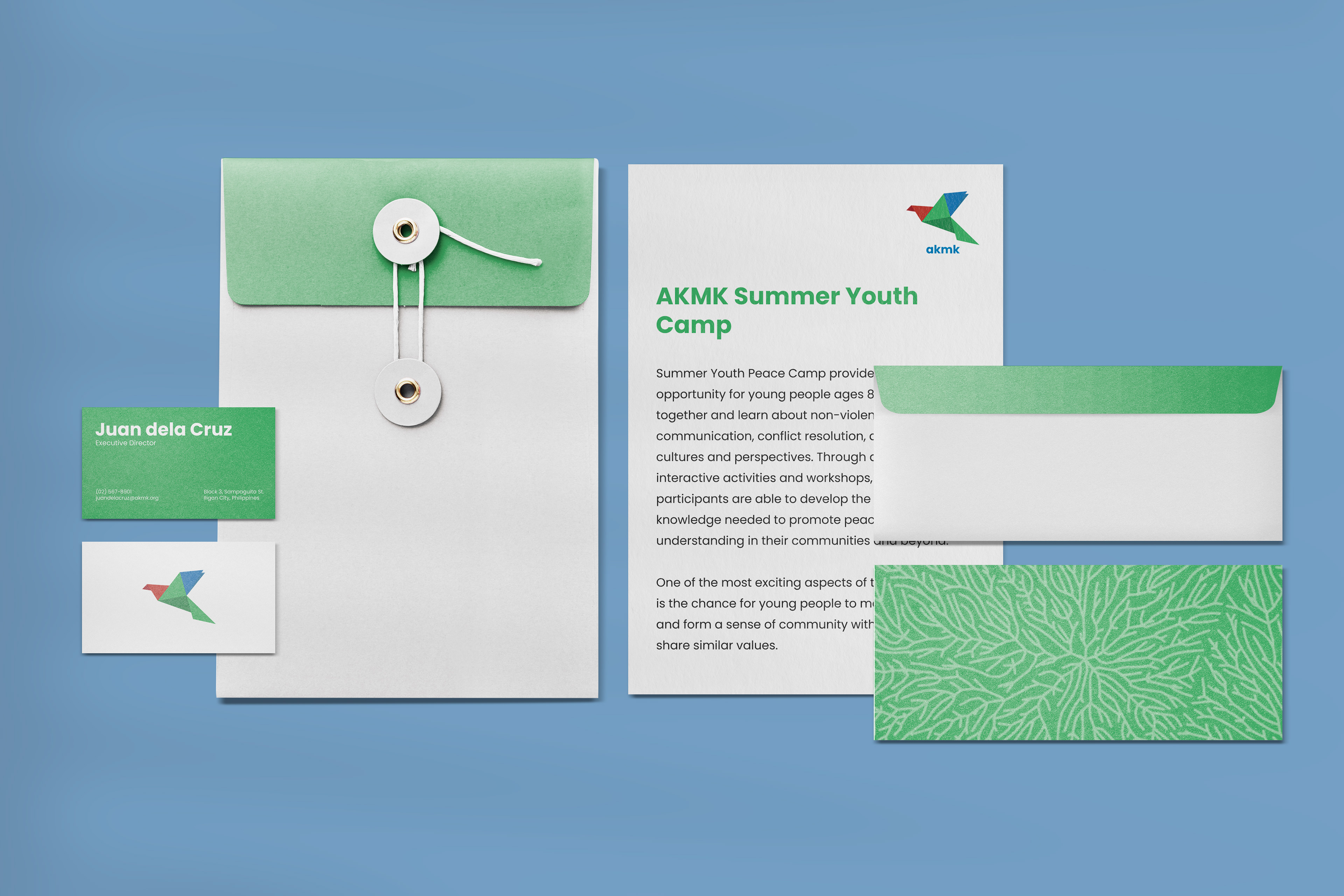
The logo was simplified while preserving meaning. Color usage was refined to reflect the organization’s tri-people (Indigenous People, Muslims, and Christians) and to allow flexibility across applications. The final mark was designed to work consistently across print, digital, and social environments.

Outcome
The modern identity supported growth in membership and staff. Improved credibility also helped secure additional funding and more projects. Social media reach and engagement increased as well.
Overall, the new identity made the message of peace in diversity easier to recognize and support.