
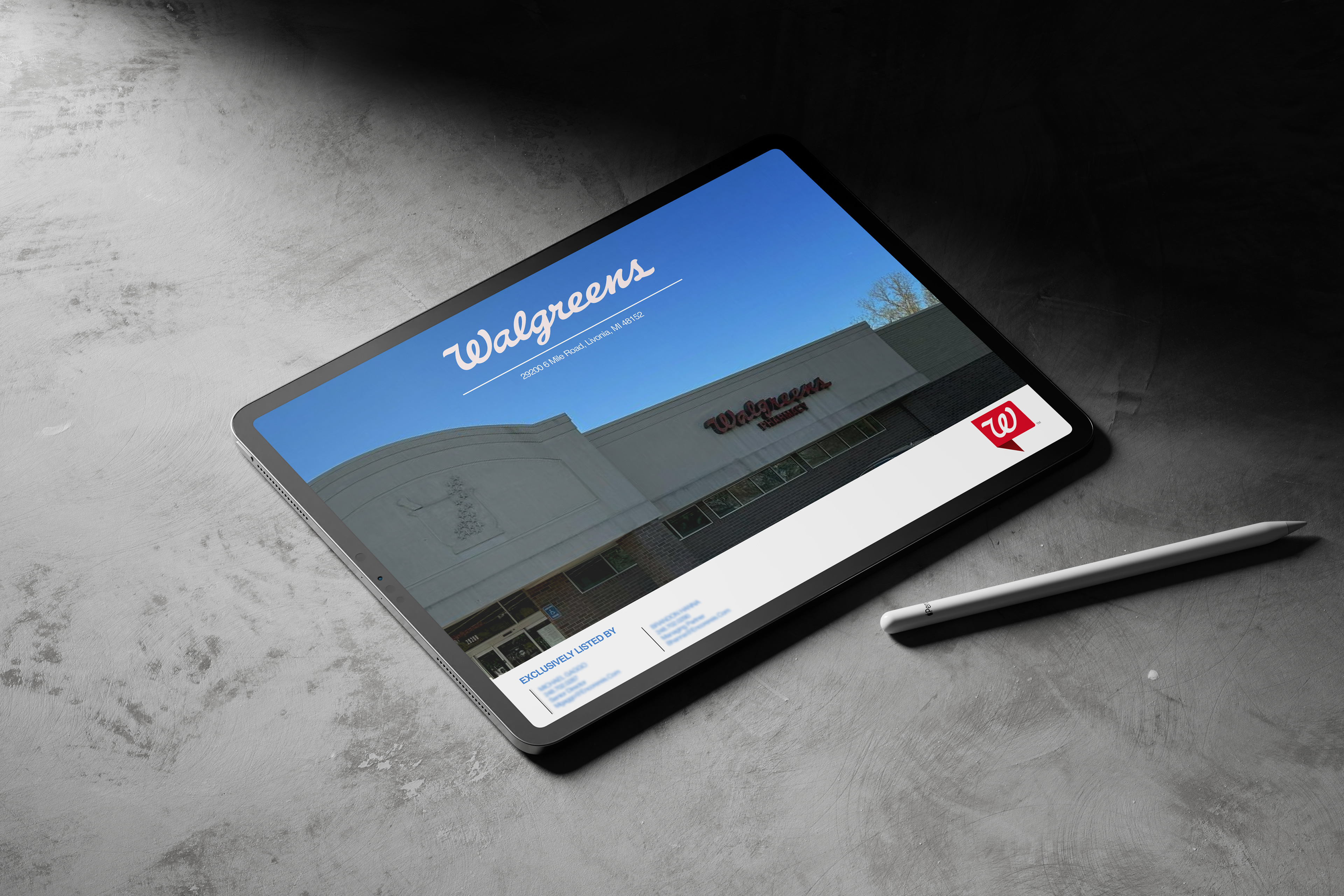
This project focused on elevating the marketing materials for a national retail listing featuring Walgreens as the tenant. The original materials lacked hierarchy and clarity, making it harder for potential investors to quickly grasp the property’s value. The goal was to create a clean, professional Offering Memorandum that presents key financial and location data in a way that’s both visually appealing and easy to understand.
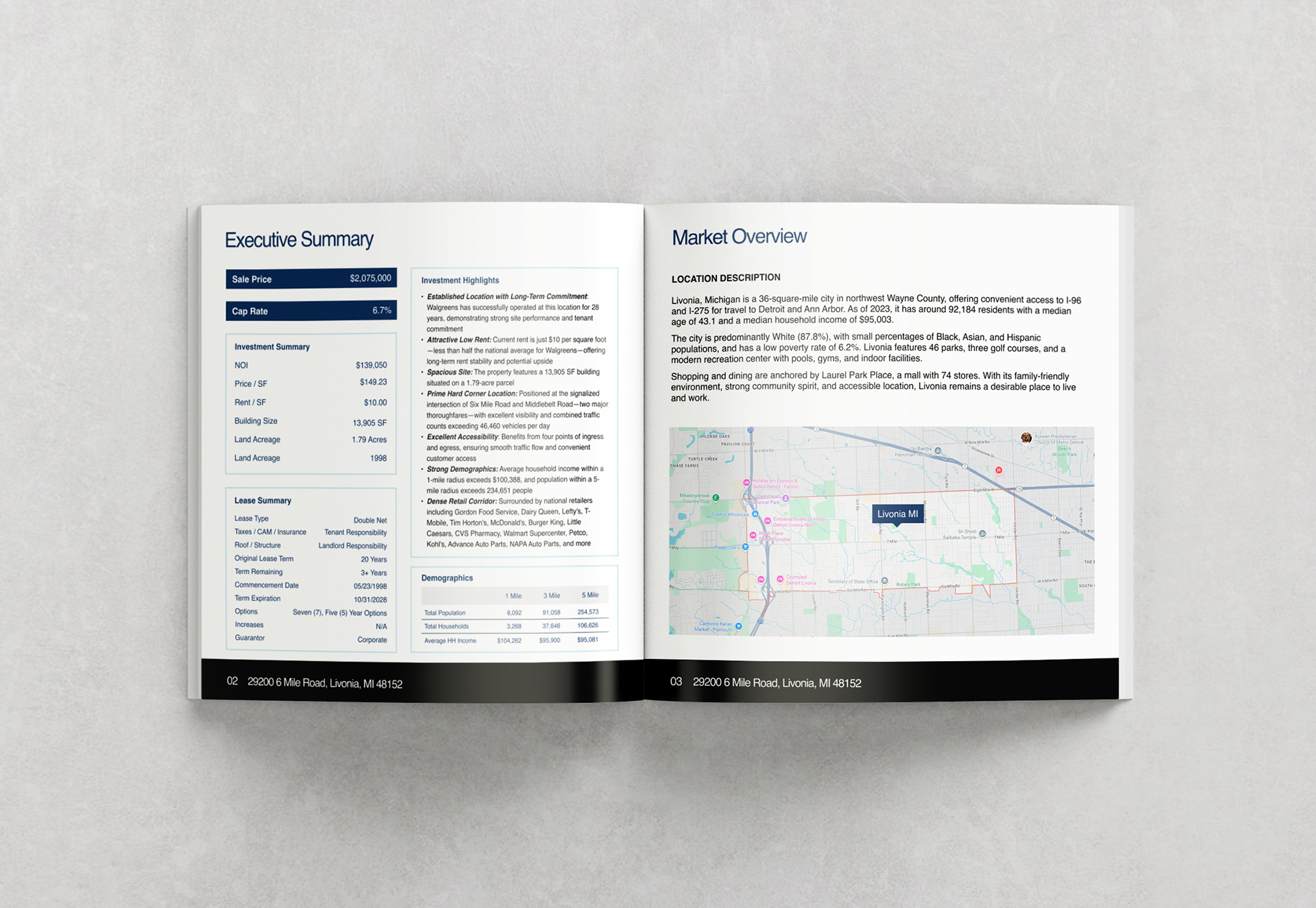
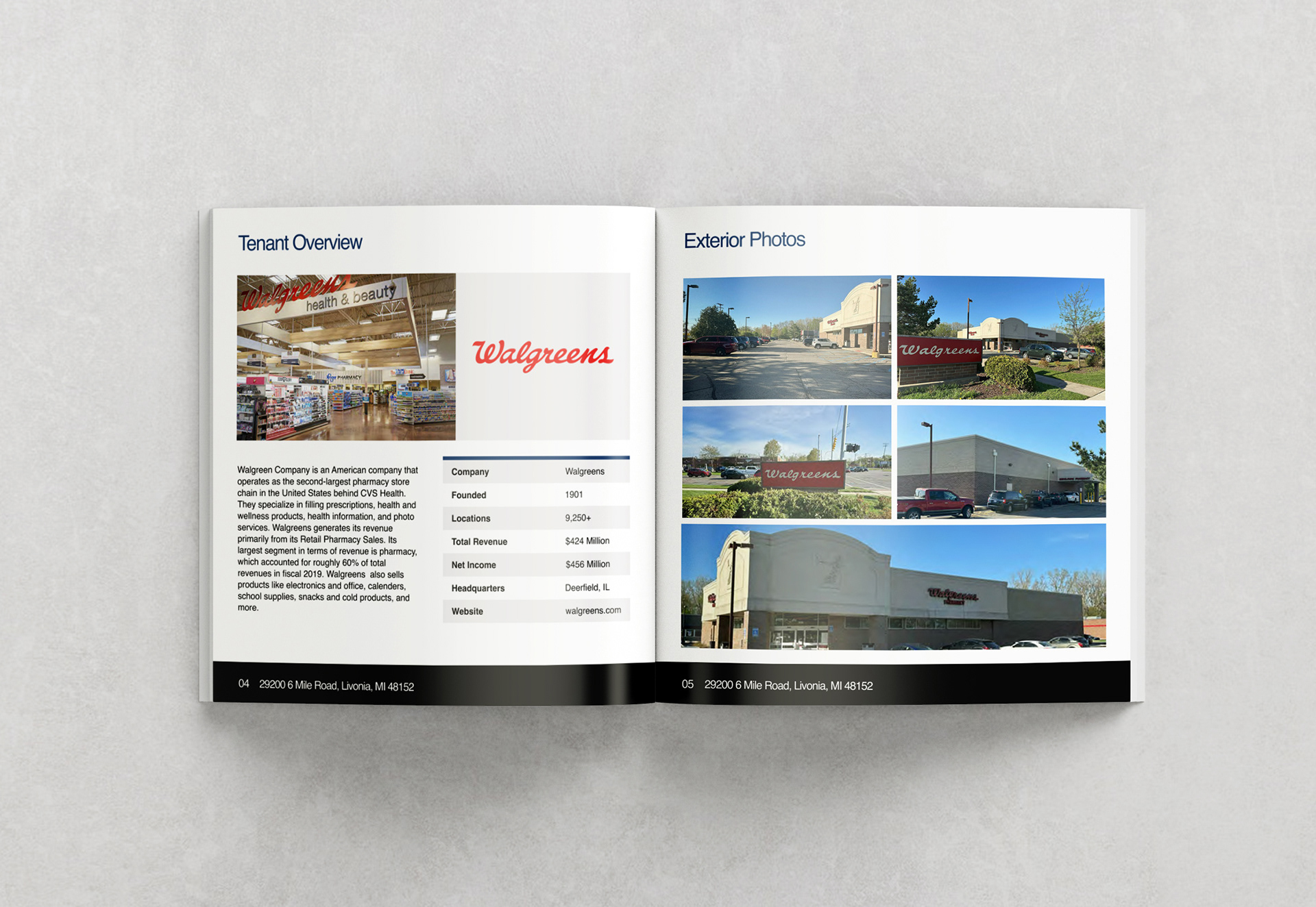
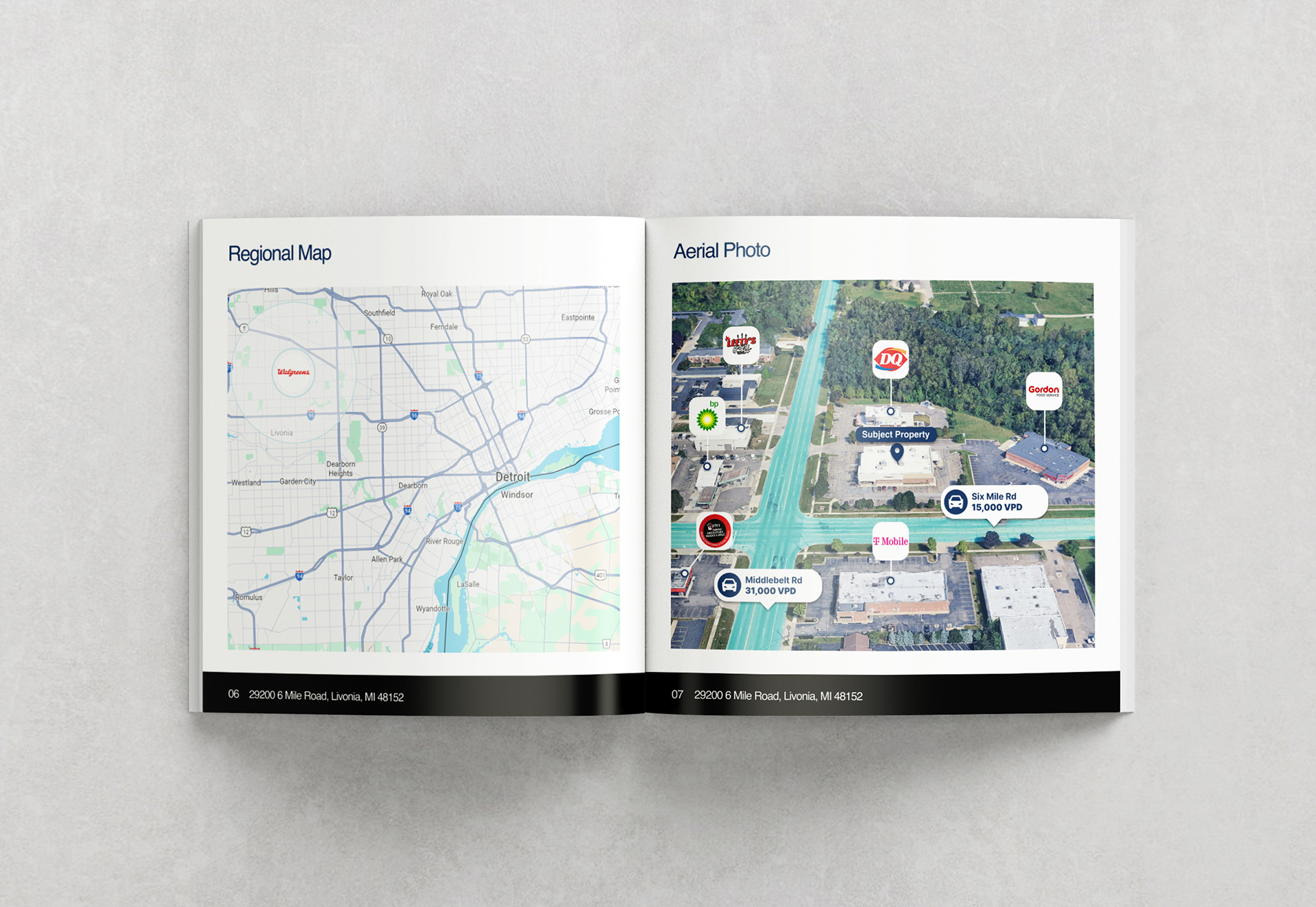
The design scope included a refreshed OM layout, a custom aerial map, and organized pages that highlight the investment summary, tenant information, and contact details. Each layout decision was made with the investor’s mindset in mind. The aerial map clearly shows nearby landmarks, road access, and visibility zones, while the investment summary page presents critical details like the cap rate, NOI, and lease terms in a format built for quick review.
The visual style balances simplicity with clarity. The layout uses strong grids, intentional white space, and consistent branding elements to support brokers in communicating the opportunity with confidence. Each page flows logically to guide the reader from the property overview to the financials and ending with a direct call to action.
This project shows how design can enhance the presentation of retail properties by making the complex feel simple. It allows investors to focus on what matters most, and gives brokers a polished tool to close deals faster.